


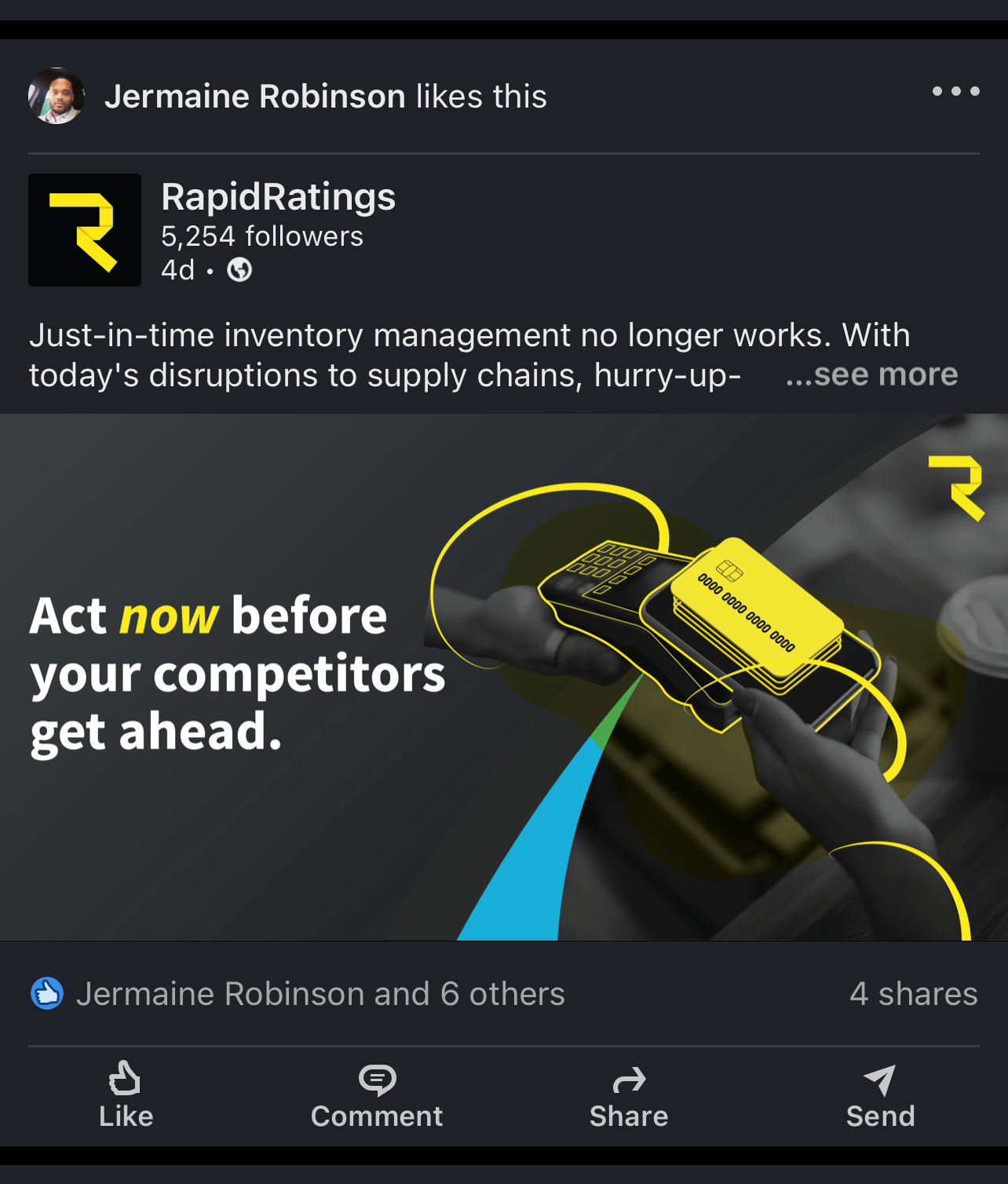
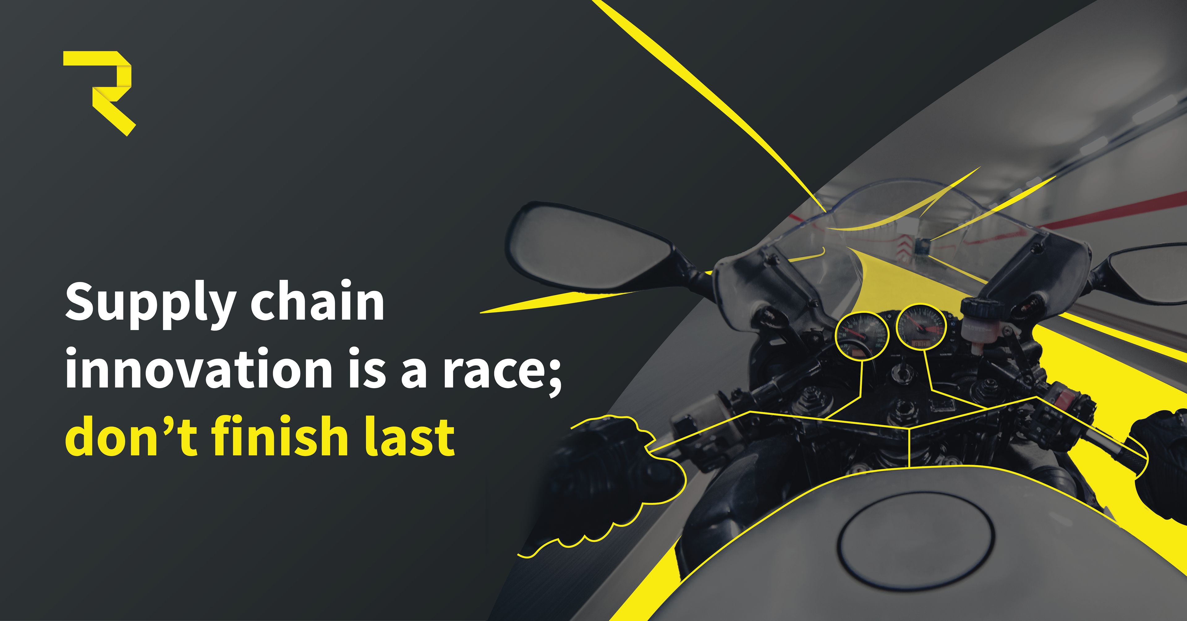
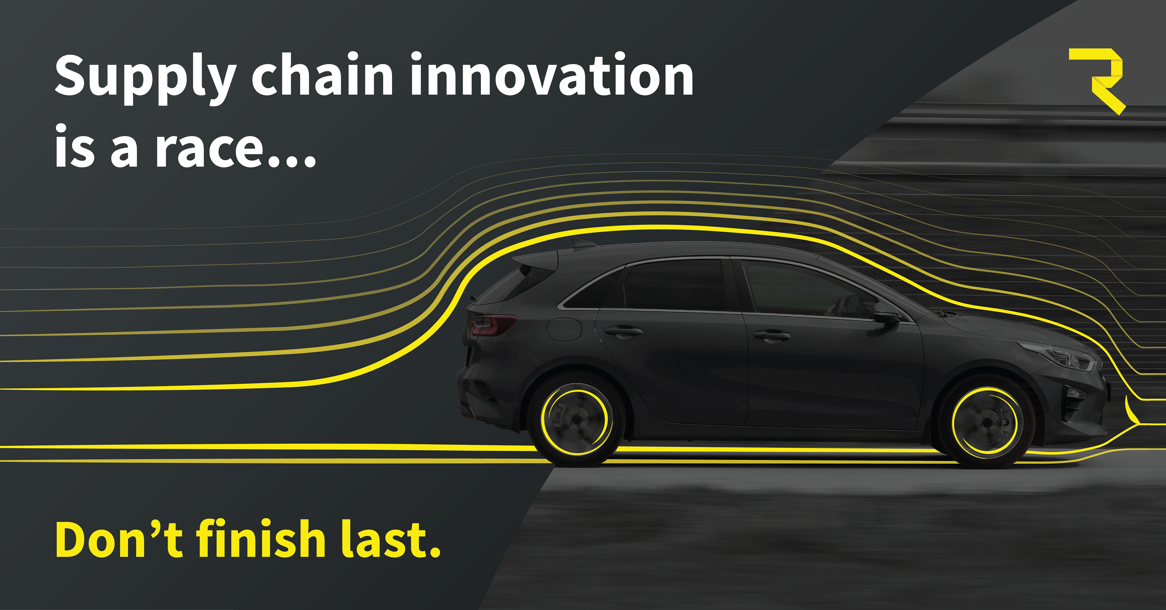
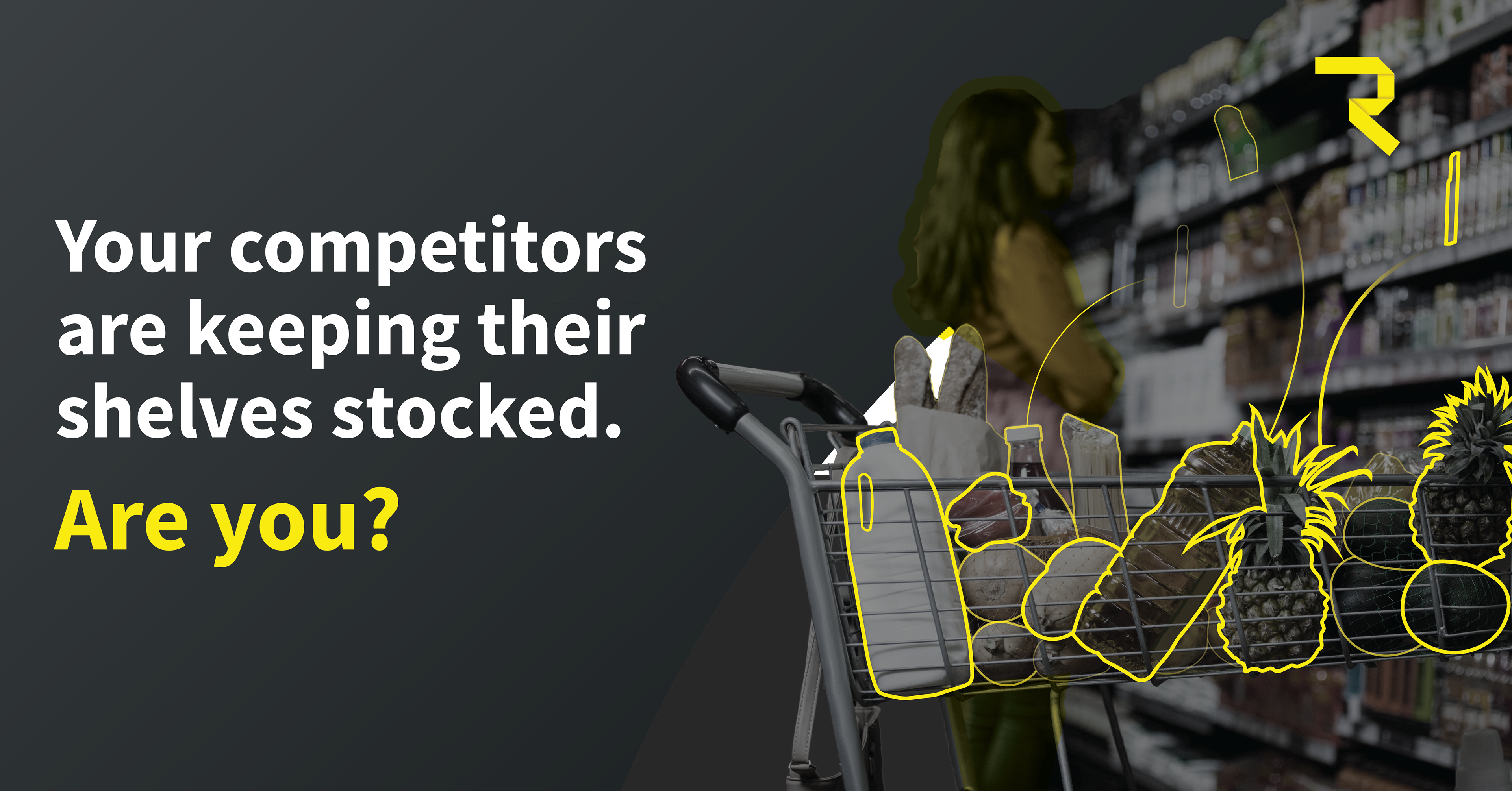
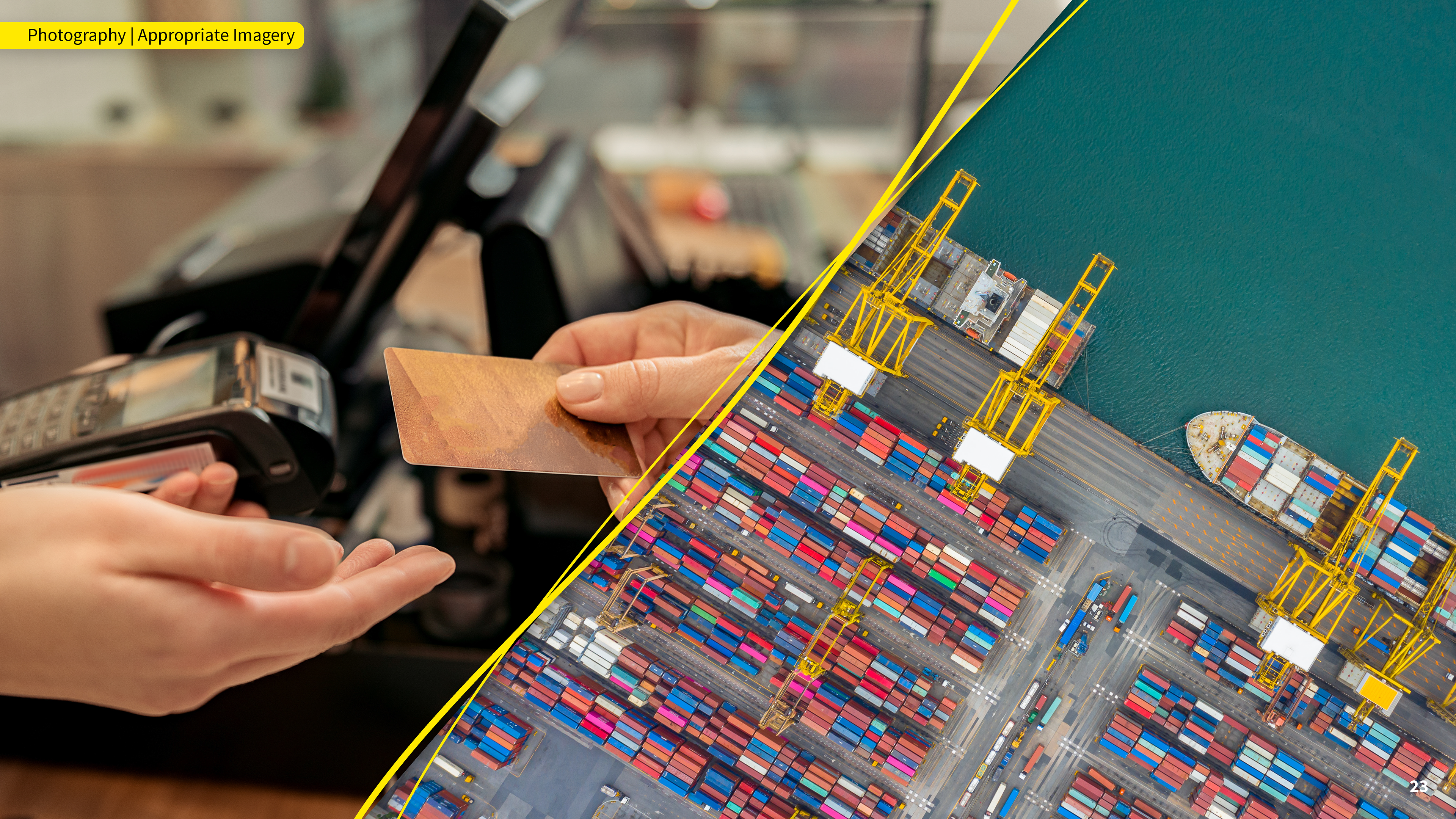
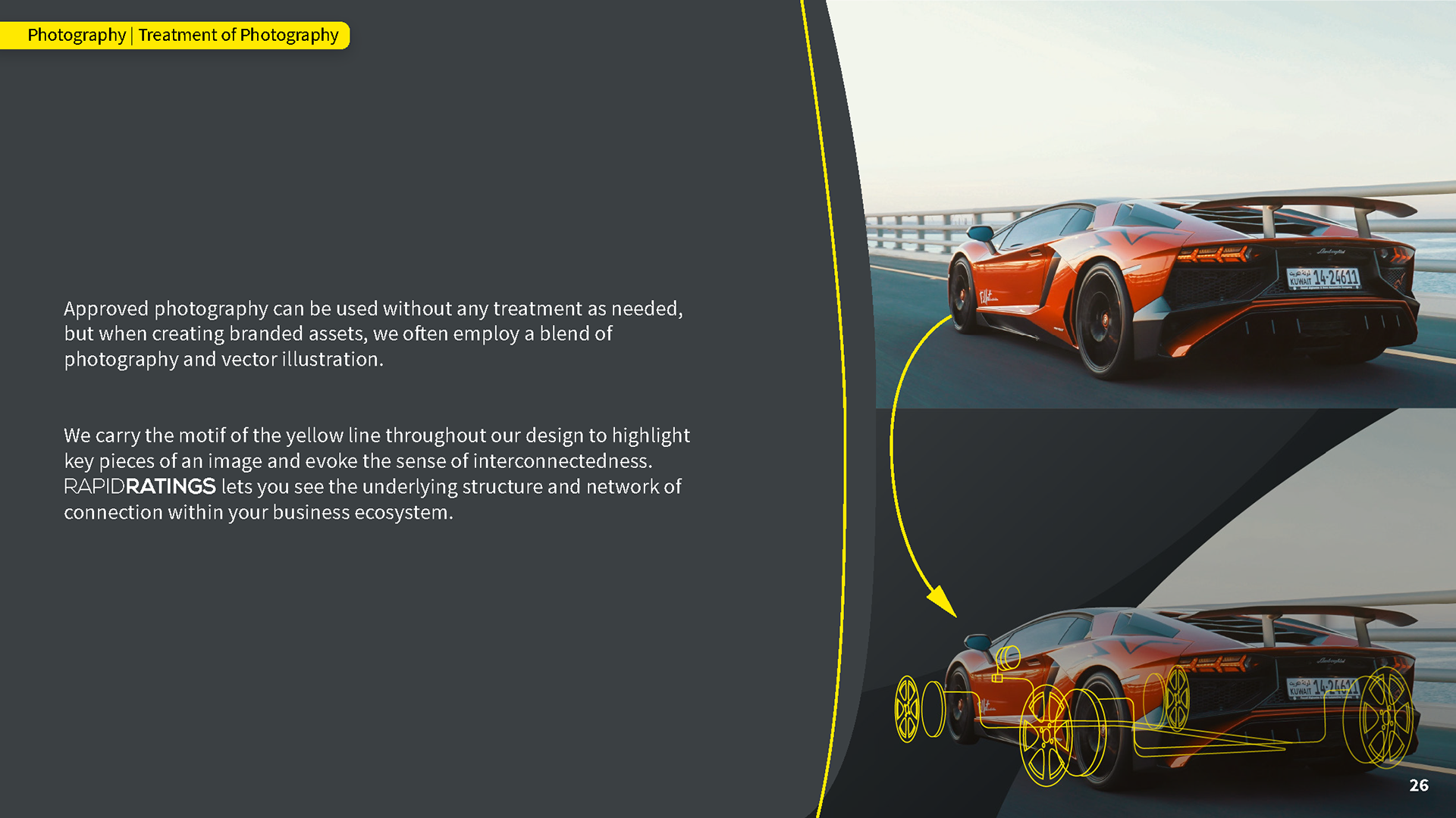
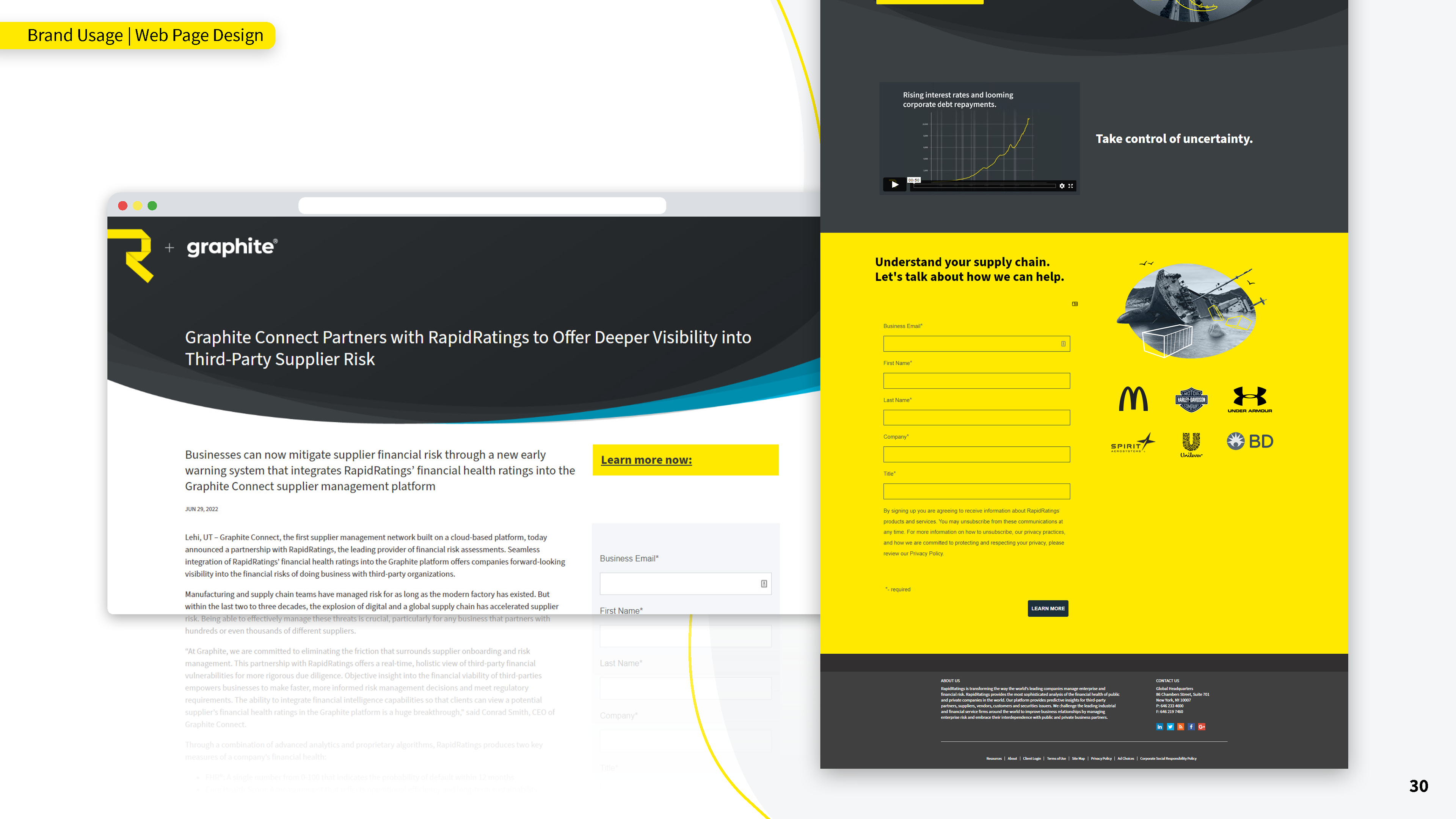
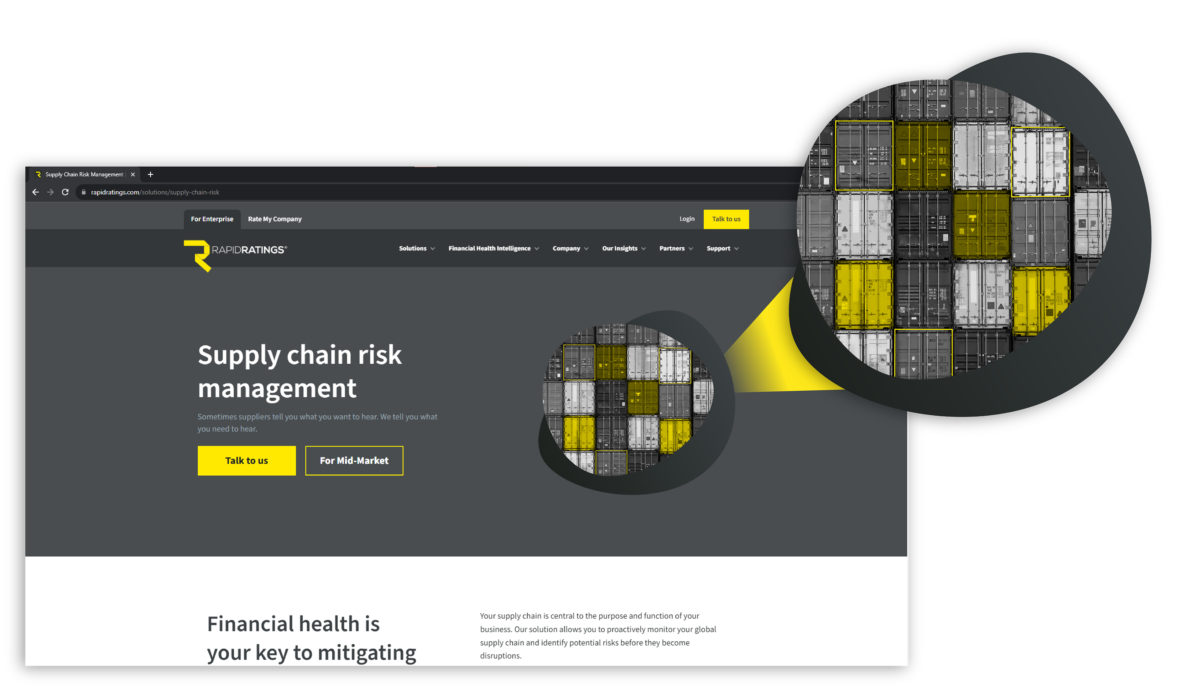
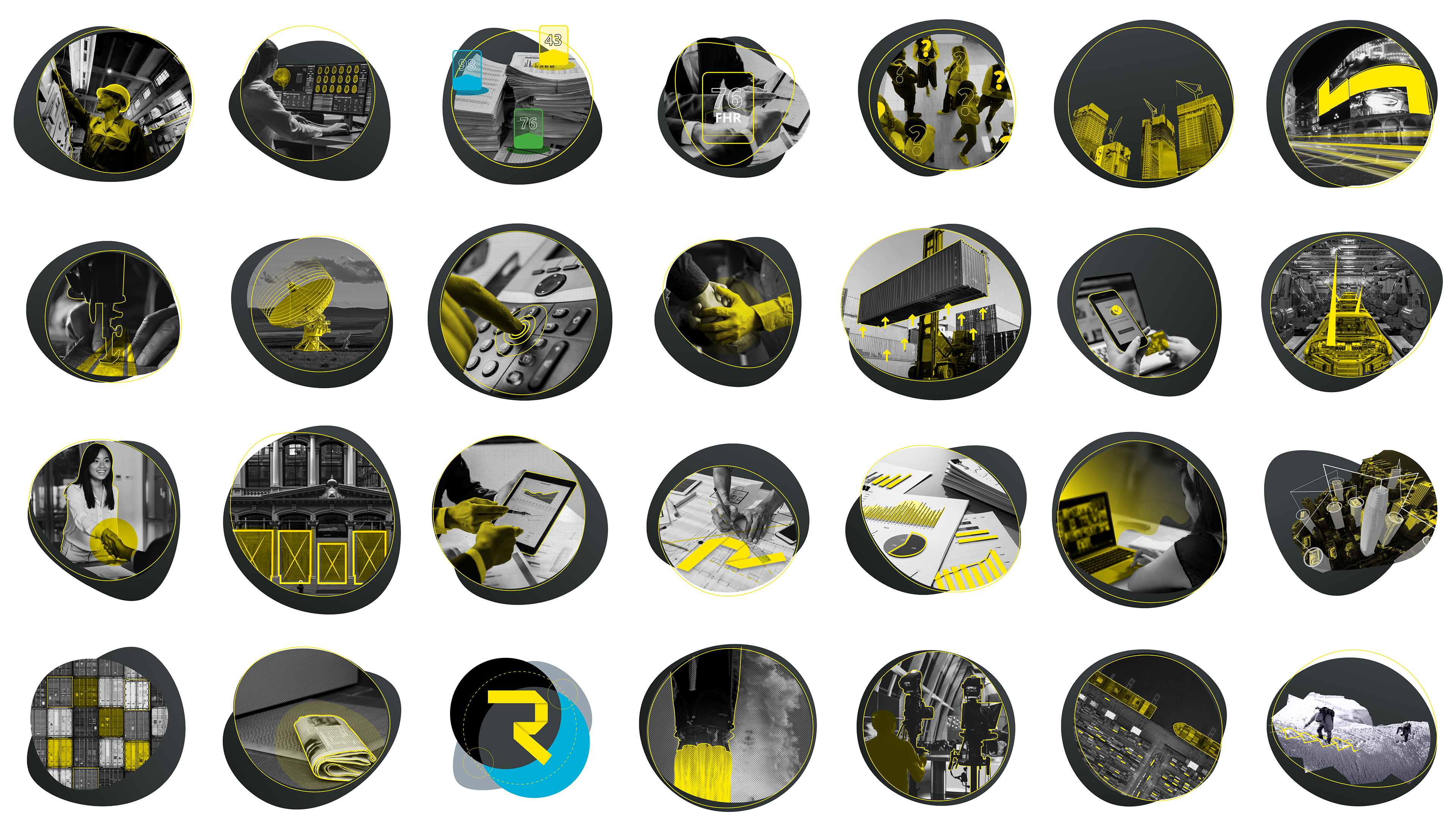
During my internship at RapidRatings, I got to learn their visual language and effectively apply it onto new ads, infographics, and whitepapers. A common theme throughout these marketing assets include their color palette of black, blue, grey, and their iconic yellow. There is also a specific treatment that they apply on photographs in which the photo would be enhanced with linework, overlaying colors, and accompanying shapes that would create a deeper narrative with a simple picture.


Using the knowledge and experience that I gained throughout the internship, I was tasked to initiate a redesign of RapidRatings' brand book which was long overdue for a refresh. I maintained the visual direction that the brand has evolved into and accurately represented that change with the new design. The result was a slide deck that effectively laid out the parameters of the brand which serves as a reference for future designs and any third parties working with the RapidRatings brand.

Integration of motion to static ad designs


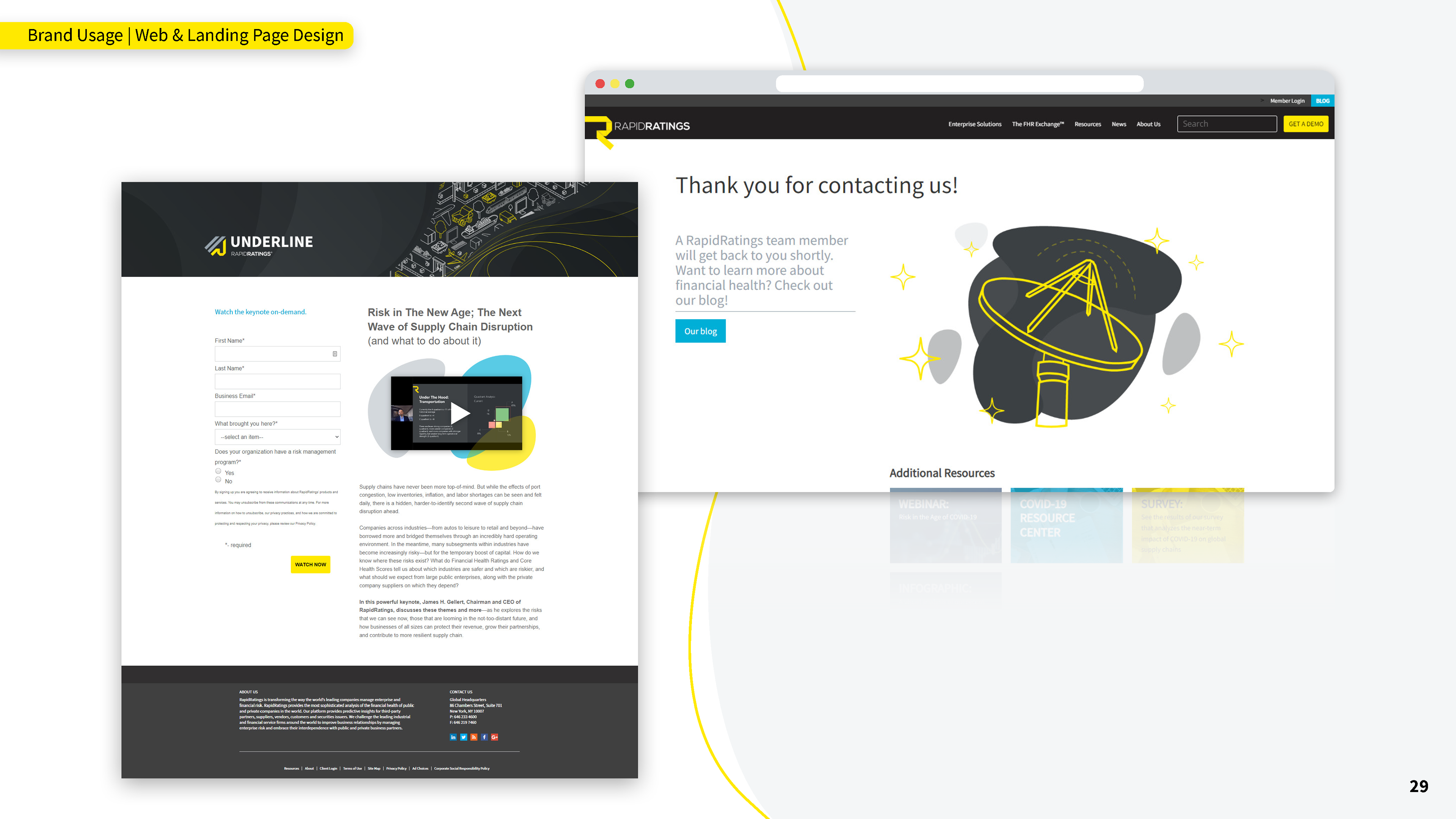
Unified family of imagery used for landing page headers
Adapting an ad campaign in both a motion graphic and carousel layout